
TL;DR:
- Mobile responsiveness greatly increases SMBs' traffic, conversions, and revenue growth.
- Responsive websites offer lower costs, better SEO, and consistent branding across all devices.
- Quick implementation via frameworks or managed services enables SMBs to enhance mobile user experience rapidly.
Mobile visitors are not patient. 53% of users abandon a site that takes more than 3 seconds to load, and most of your traffic is already coming from phones. For small and medium-sized businesses, a slow or hard-to-navigate site is not just a technical problem. It is a revenue problem. This article breaks down the most impactful benefits of mobile responsive design, with real numbers and practical examples so you can see exactly what is at stake and what to do about it.
Table of Contents
- Why mobile responsiveness is essential for SMBs
- Top business benefits of mobile responsive websites
- Maximizing marketing and customer engagement
- Mobile responsive versus other website options
- Quick tips for implementing mobile responsiveness easily
- Our take: Responsive design is non-negotiable for modern SMBs
- Boost your business with custom mobile responsive landing pages
- Frequently asked questions
Key Takeaways
| Point | Details |
|---|---|
| Drives more sales | Mobile responsive design can double mobile conversions and boost ROI quickly for SMBs. |
| Saves time and money | A single responsive site is simpler to update and manage than maintaining separate desktop and mobile sites. |
| Supercharges marketing | Responsive websites convert more mobile visitors from ads, search, and social media into customers. |
| Easy implementation | Frameworks and landing page services make it fast and straightforward to launch responsive sites without technical skills. |
Why mobile responsiveness is essential for SMBs
A mobile responsive website automatically adjusts its layout, text size, and images to fit any screen. Whether a visitor opens your site on a phone, tablet, or desktop, the experience stays clean and functional. That flexibility is no longer a bonus feature. It is the baseline expectation.
User behavior has shifted dramatically. 60 to 63% of global traffic now comes from mobile devices, and poor user experience on those devices leads directly to high abandonment rates. Visitors expect pages to load fast, buttons to be easy to tap, and content to be readable without zooming.
Here is what mobile users expect from any site they visit:
- Pages that load in under 3 seconds
- Navigation that works with one thumb
- Text that is readable without pinching or zooming
- Forms and checkout flows that work on small screens
- Consistent branding across all devices
SMBs that ignore these expectations fall behind fast. A competitor with a mobile optimized website will capture the customer you just lost to a slow load or a broken layout. The gap between responsive and non-responsive sites is not closing. It is widening.
With this urgent need clear, let's break down the concrete benefits for your business.
Top business benefits of mobile responsive websites
The numbers behind mobile responsiveness are hard to ignore. SMBs with responsive sites grow 2.5 times faster, achieve 91% higher mobile visits, 67% more mobile conversions, and see up to 245% ROI on redesigns. These are not projections. They are documented outcomes from businesses that made the switch.

| Metric | Before responsive design | After responsive design |
|---|---|---|
| Mobile visits | Baseline | Up 91% |
| Mobile conversions | Baseline | Up 67% |
| Revenue growth rate | Average | 2.5x faster |
| Redesign ROI | N/A | Up to 245% |
Large brands confirm the pattern too. Walmart saw a 98% jump in mobile sales after completing a responsive redesign. While your business may be smaller, the principle holds.
Key benefits you can expect:
- Larger customer base because your site works for every visitor, not just desktop users
- Lower development costs because one codebase serves all devices instead of maintaining separate sites
- Faster marketing results because campaigns land on pages that actually convert on mobile
- Stronger brand trust because a polished mobile experience signals professionalism
Pro Tip: A responsive redesign often pays for itself within the first few months through improved conversions alone. When you look at custom landing pages built specifically for mobile performance, the payback timeline gets even shorter.
Now that you see the impact, here's how responsive design strengthens your marketing and customer engagement.
Maximizing marketing and customer engagement
Every dollar you spend on ads, social media, or email campaigns depends on what happens when someone clicks your link. If that landing page fails on mobile, the campaign fails too. Responsive design protects your marketing investment.
Here is how a responsive site improves your marketing results step by step:
- Faster load times improve your Quality Score in Google Ads, which lowers your cost per click
- Google's mobile-first indexing means responsive sites rank higher in search results, driving more organic traffic
- Better usability increases form submissions, phone calls, and purchases from mobile visitors
- Consistent experience across devices means your brand message lands clearly every time
A seamless mobile experience turns clicks into loyal customers.
The evidence is real. Time Magazine saw a 30% traffic increase after a responsive redesign. Better mobile conversions are not accidental. They come from design decisions that put the mobile user first at every step.
While engagement drives results, let's compare mobile-first approaches against other options for SMBs.
Mobile responsive versus other website options
Not all approaches to mobile are equal. Some businesses still run separate mobile sites or stick with non-responsive layouts. Here is how the options compare.
| Feature | Responsive design | Dedicated mobile site | Non-responsive site |
|---|---|---|---|
| Maintenance effort | Low (one codebase) | High (two sites) | Low but risky |
| Cost over time | Low | High | Low initially |
| SEO performance | Strong | Split authority | Weak |
| Brand consistency | High | Moderate | Low |
| Mobile user experience | Excellent | Good | Poor |
A single codebase with responsive design means lower costs and consistent branding, two things every SMB needs to protect.
Dedicated mobile sites require double the updates, double the content management, and split SEO authority across two URLs. Non-responsive sites push bounce rates up and sales down. Responsive design is the only option that handles speed, cost, and marketing impact without trade-offs.
With this comparison in mind, let's look at practical steps to get started.
Quick tips for implementing mobile responsiveness easily
Getting a responsive site does not require a large technical team. Here are the steps that work for most SMBs:
- Start with a proven framework. Tools like Bootstrap or Foundation give you reliable, tested layouts without building from scratch.
- Test on real devices. Emulators miss real-world issues. Test on actual phones before you launch.
- Optimize your images. Large image files are the most common cause of slow mobile load times.
- Check Core Web Vitals. Optimizing Core Web Vitals delivers 20% or better speed improvements, which directly affects both rankings and user experience.
- Use a managed service. Mobile responsive landing pages built by specialists skip the technical setup entirely.
Pro Tip: If you are not a developer, skip the DIY frameworks and go straight to a managed landing page service. You get a professional result in days, not weeks, without touching a single line of code.
Having clear steps in place, let's consider which approach pays off most for SMBs today.
Our take: Responsive design is non-negotiable for modern SMBs
Many SMBs still treat mobile responsiveness as optional. That is a costly mistake. The data is clear, and the competitive gap is real. Businesses that delay this investment do not just miss conversions. They lose credibility with every visitor who bounces from a broken mobile layout.
The ROI arrives fast. Conversions improve within weeks of launch. Brand perception improves immediately. And the cost of inaction compounds every month you wait.
First impressions happen on mobile for most visitors. If that first impression is a slow, unreadable page, the relationship ends before it starts. Building effective responsive landing pages is not a luxury upgrade. It is the foundation of a functional digital presence in 2026.
Boost your business with custom mobile responsive landing pages
All the benefits covered in this article are achievable without a large budget or a technical team. Landing Page Studios builds fast, fully managed, mobile responsive landing pages with a 2-day turnaround and all-inclusive pricing at $199.99 per year.
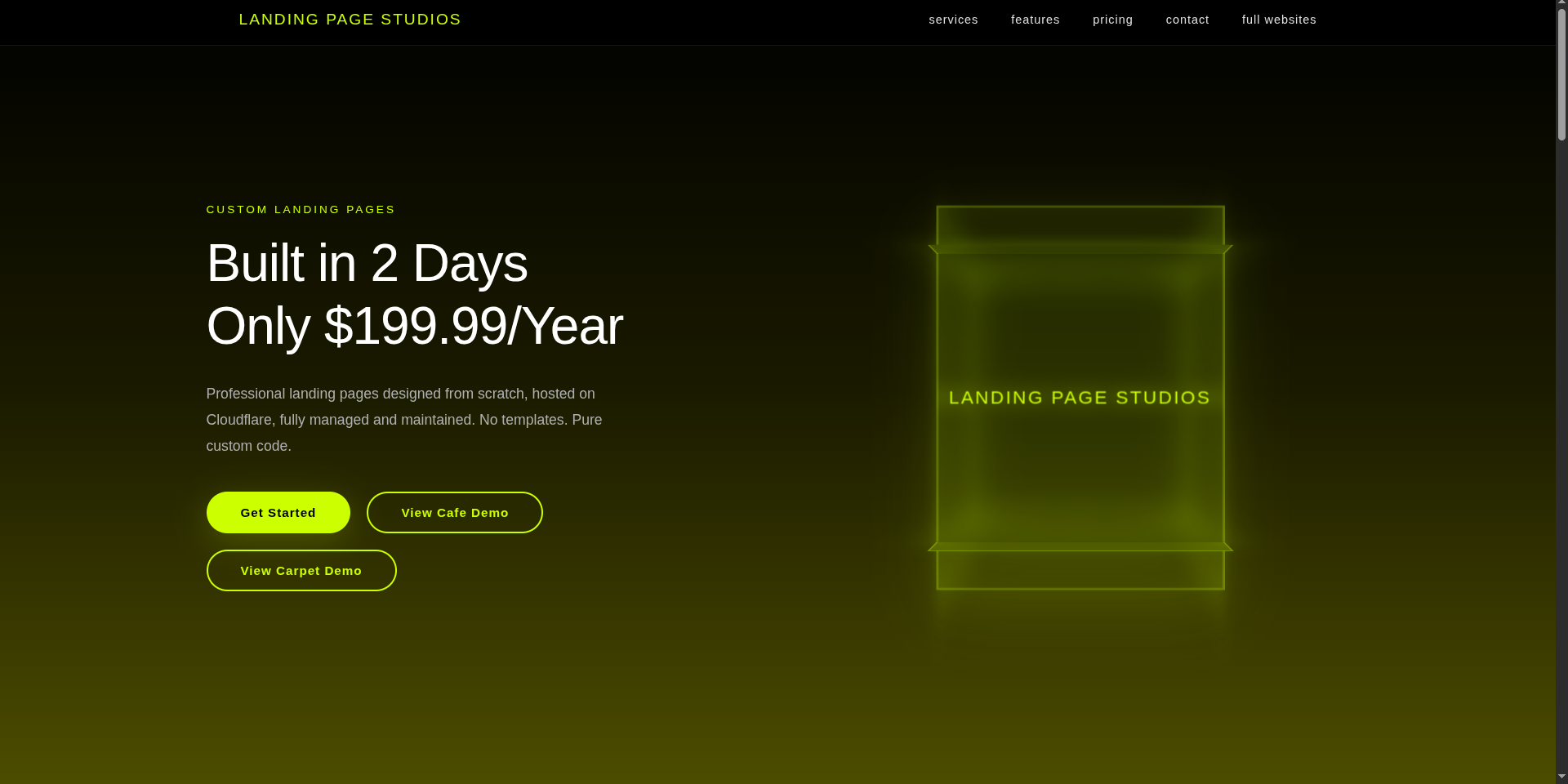
Hosting, updates, and support are included. No coding required on your end. If you are ready to capture more mobile traffic and turn visitors into customers, explore our custom landing page solutions and see how fast a professional presence can be live.
Frequently asked questions
What does mobile responsive mean?
It means your website automatically adapts to look and work correctly on any screen size, from phones to desktops, giving every visitor a consistent experience.
How much can mobile responsiveness boost sales?
Studies report up to 98% higher mobile sales and 67% more mobile conversions after a responsive redesign, with results varying by industry and implementation.
Is a separate mobile site better than responsive design?
No. Responsive design with a single codebase is more cost-effective, easier to manage, and performs better for SEO and modern marketing campaigns.
What is the easiest way for SMBs to get a responsive site?
Frameworks like Bootstrap and managed mobile landing page services let SMBs launch professional, responsive sites quickly without any coding knowledge required.