
TL;DR:
- Most small business landing pages fail due to vague headlines and hidden forms.
- Successful pages focus on clear value, minimal distractions, prominent CTAs, and social proof.
- Tools like no-code builders and quick testing enable SMBs to optimize without a large tech team.
Most small businesses pour real money into ads, then send that traffic to a landing page that does almost nothing. The form is buried. The headline is vague. The offer is unclear. Leads slip away before the page even loads. The good news is that fixing this does not require a developer, a big budget, or weeks of work. This guide covers every step, from the elements that drive conversions to the tools, build process, and testing routines that help SMBs compete without the overhead of a large marketing team.
Table of Contents
- What makes a lead capture landing page work?
- Essential tools and preparation
- Step-by-step: Build and launch your landing page
- Optimize, test, and avoid common mistakes
- Why you don't need a tech team to compete with big brands
- Ready to launch your next landing page?
- Frequently asked questions
Key Takeaways
| Point | Details |
|---|---|
| Focus on essentials | A clear headline, value, and visible form are non-negotiable for collecting more leads. |
| Short forms perform better | Limit lead forms to 3-4 fields for the biggest conversion boost. |
| Speed beats complexity | Simple, mobile-friendly pages with quick edits outperform slow, overbuilt ones. |
| Keep optimizing | Test headlines, CTAs, and reduce friction to continually increase conversions. |
What makes a lead capture landing page work?
Most landing pages fail for the same reasons. Too much text, too many links, and no clear reason for the visitor to act. The fix starts with understanding what actually drives conversions.
Custom landing page essentials come down to six non-negotiable elements. According to conversion research, lead capture pages convert best when they feature a clear value proposition, a compelling headline, minimal distractions, prominent calls to action, social proof, and high-quality visuals. Remove any one of these and performance drops.
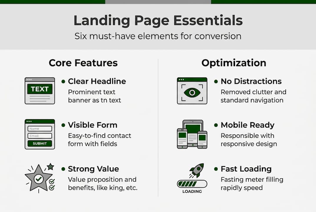
Here is how high-performing pages compare to low-performing ones:
| Element | High-performing page | Low-performing page |
|---|---|---|
| Headline | Specific, benefit-driven | Generic or vague |
| CTA | Single, prominent, repeated | Multiple, buried, or missing |
| Form | 3 to 4 fields, above the fold | Long form, hard to find |
| Visuals | Relevant, fast-loading | Stock photos, slow to load |
| Social proof | Testimonials, logos, ratings | None or hidden at bottom |
| Distractions | Navigation removed | Full site nav present |
Common pitfalls that kill conversions include:
- Information overload: Visitors scan, they do not read. Long paragraphs push them away.
- Unclear offers: If the visitor cannot tell what they get in five seconds, they leave.
- Buried forms: Placing the form below the fold assumes visitors will scroll. Many will not.
- Too many CTAs: Giving visitors multiple choices creates hesitation. One goal per page works best.
"A landing page with a single, focused call to action consistently outperforms pages with multiple competing goals. Clarity is the conversion lever most SMBs underuse."
The fastest way to improve a landing page is to remove things, not add them. Strip out navigation menus, sidebars, and any link that takes visitors away from your offer. Every distraction is a leak in your conversion funnel.
Essential tools and preparation
Before you build anything, you need the right tools and the right assets ready. Jumping into a builder without a clear offer and headline is the fastest way to waste time.
Here is a quick comparison of tools worth considering for SMBs:
| Tool | Cost | Use case |
|---|---|---|
| HubSpot | Free (CRM tier) | Lead capture with CRM integration |
| Unbounce | From $99/month | Templates and A/B testing |
| Leadpages | From $49/month | Fast builds, drag and drop |
| Landing Page Studios | $199.99/year | Custom design, fully managed hosting |
| Carrd | From $19/year | Simple single-page sites |
For SMBs, no-code landing page builders like HubSpot (free with CRM integration) and Unbounce or Leadpages (with templates and A/B testing) are the practical starting point. The priority is fast setup without developers, short forms, and mobile-first design.
Before you open any builder, gather these assets:
- Your core offer: What does the visitor get? Be specific. "Free 15-minute audit" beats "Learn more."
- A working headline: Lead with the benefit, not the feature.
- Visuals: One strong image or short video. Avoid generic stock photos.
- Trust signals: Testimonials, client logos, review counts, or certifications.
- Your form fields: Decide in advance. Name and email is often enough.
Mobile optimization and fast load times are not optional extras. They are prerequisites. A page that loads slowly on a phone will lose visitors before they see your offer.

Pro Tip: When selecting a template, pick one where the headline and form are visible without scrolling on a phone screen. Avoid templates with large hero images that push content down. Simplicity loads faster and converts better.
Step-by-step: Build and launch your landing page
With your tools and assets ready, here is the build process in order:
- Select your template. Choose a layout with a single column, minimal design, and the form above the fold. Avoid multi-column templates that add visual noise.
- Write your headline first. Your headline is the most important line on the page. Focus on the specific outcome the visitor gets. "Get 10 qualified leads in 30 days" is stronger than "Our lead generation service."
- Add your offer copy. Three to five bullet points explaining what the visitor receives. Keep each point under 10 words.
- Insert your lead form. Shorter forms convert significantly better: 3 to 4 fields convert about 120% better than forms with 11 fields. Place the form above the fold, beside your offer copy, and repeat it every 350 words on longer pages.
- Add visuals. One image or video that shows the result, not the process. Compress images before uploading.
- Insert trust elements. Add at least one testimonial with a real name and photo. Include any relevant badges or certifications near the form.
- Set your confirmation page. After form submission, redirect to a thank-you page. This also lets you track conversions accurately.
- Run mobile and speed tests. Use Google PageSpeed Insights before you publish. A 1-second load delay cuts conversions by 7%, and roughly 80% of landing page traffic now comes from mobile devices.
Pro Tip: Once your first page is live, duplicate it and change one variable, such as the headline or offer, to create a second version for a different audience segment. This saves build time and gives you a ready-made test.
The landing page setup process does not need to be complex. A focused page with a clear offer, a short form, and one strong visual will outperform an overbuilt page almost every time.
Optimize, test, and avoid common mistakes
Launching is step one. What happens after launch determines whether the page keeps delivering leads or quietly stops working.
Start with the PIE framework to decide what to test first. PIE stands for Potential (how much room for improvement), Importance (how much traffic or revenue is affected), and Ease (how simple the change is to implement). Score each test idea on these three factors and prioritize the highest scores.
A simple test and iteration cadence:
- Run each test for at least two weeks or until you have 100 conversions per variation.
- Test one element at a time: headline, CTA text, form length, or button color.
- Record results in a simple spreadsheet before moving to the next test.
- Apply the winning version and start the next test immediately.
Here are the most common mistakes SMBs make and the straightforward fixes:
| Mistake | Easy fix |
|---|---|
| Weak or vague headline | Rewrite to lead with a specific benefit |
| Too many form fields | Cut to name and email only |
| CTA buried below the fold | Move CTA button to top of page |
| No social proof | Add one testimonial with a photo |
| Page loads slowly | Compress images, remove unused scripts |
| Navigation links present | Remove all nav links from the page |
Companies with 40 or more landing pages generate 12 times more leads than those with just 1 to 5 pages. A/B testing a headline alone can lift conversions by 34%, adjusting CTA placement by 21%, and reducing form fields by 18%.
These numbers make the case for ongoing A/B testing of landing pages better than any opinion could. Small, consistent improvements compound quickly.
Why you don't need a tech team to compete with big brands
Conventional wisdom says you need a large budget, a dev team, and enterprise software to build landing pages that perform. That assumption is wrong, and the data backs it up.
Large companies move slowly. They run tests through approval chains, wait for developer sprints, and debate copy for weeks. A small team can write a new headline, push it live, and have real conversion data in 48 hours. That speed advantage is more valuable than any enterprise tool.
The SMBs that consistently outperform bigger competitors do one thing differently: they act on data instead of assumptions. They do not wait for a perfect page. They launch a good-enough page, measure it, and improve it. That feedback loop, running fast and often, is what drives results.
Affordable landing page options now give small teams access to the same quality of design and hosting that large brands use. The gap is no longer about resources. It is about execution speed and willingness to test. A focused SMB with a clear offer and a habit of testing will out-convert a slow-moving enterprise page almost every time.
Ready to launch your next landing page?
If you have read this far, you have a clear picture of what a high-converting lead capture page needs and how to build one without a technical team. The next step is putting it into practice.
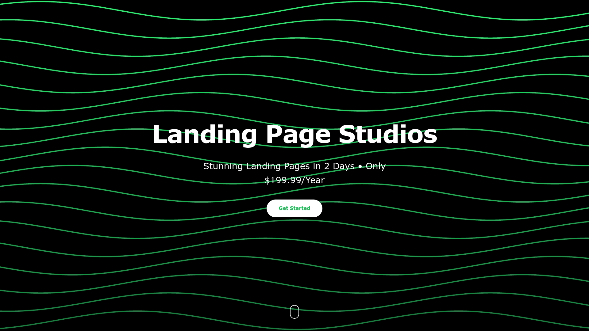
Landing Page Studios offers a fully managed custom landing page service built specifically for SMBs. You get a custom-designed page live in two days, hosted on Cloudflare's global network, with unlimited revisions and all-inclusive pricing at $199.99 per year. No developers, no long-term contracts, and no technical headaches. If you want a page that applies every best practice in this guide from day one, this is the most direct path to get there.
Frequently asked questions
What is the ideal number of form fields for lead capture?
3 to 4 fields is optimal, as shorter forms convert about 120% better than longer ones with 11 fields. Start with name and email, then add one more field only if it is essential for follow-up.
Where should I place the lead capture form on my landing page?
Place the form above the fold and next to your offer copy. For longer pages, repeat the form every 350 words so visitors always have a clear way to convert.
How many landing pages do I need to generate more leads?
Businesses with 40 or more pages generate up to 12 times more leads than those with just 1 to 5 pages. More targeted pages mean more opportunities to match offers to specific audiences.
Do mobile-optimized landing pages really matter for SMBs?
Yes. About 80% of landing page traffic now comes from mobile devices, so a page that performs poorly on a phone will miss the majority of your potential leads.